A couple of readers suggested that I produce a stacked bar chart for Whitbread grists.
I'll be honest, I didn't know what they meant by a stacked bar chart. My initial reaction was: "Fuck them. Let them create their own fucking fancy charts." Then I realised that it was a way of spinning out another post from this rather threadbare carpet of data.
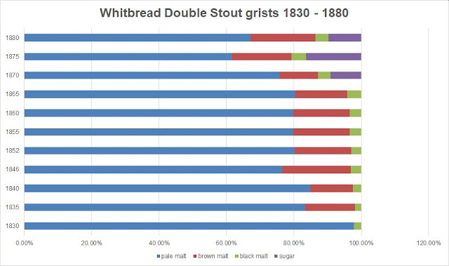
So I went into Excel and had a fiddle around. And this is what I came up with:
Is this what you meant? I hope it is. Because I've also done one for the Stout grists:
If you like these charts, I can produce more of them. It is, after all, a piece of piss with Excel.


5 comments:
Interesting how Whitbread did away with brown malt altogether in 1830, only to see it back again and remain a fixture through the decades. Was the brown malt that returned in 1835 the ‘new’ brown malt, i.e., closer to the darkly kilned, non-diastatic malt we would recognise today?
Well done. THIS is how to turn all of tables into eye candy, Ron! Yes stack some more numbers and also look at other visual options in Excel . . . the highly visual types (who are also statisticians) like me will love it and besides, something quite literally might APPEAR in the info that you present in this form that is not apparent immediately in a standard table of numbers.
Well done . . . this Ron, is how to make your charts into eye candy! People like me who are highly visual AND are statistically trained and minded, will smile seeing your charts converted this way. Things can become more noticeable when you put this visual format on your information - things that might not be so apparent when you just have a standard table of numbers. Here for example, how and when sugar began to appear and increase. I would not overdo the Excel graphics, maybe oe a month give us something colourful and visual to gaze at!
I hadn't understood either what was asked, but this is a really neat way of showing the historical changes of all components at a glance. Brilliant!
Looks great Ron! These show really easily how the grists changed through time. Great stuff!
Post a Comment