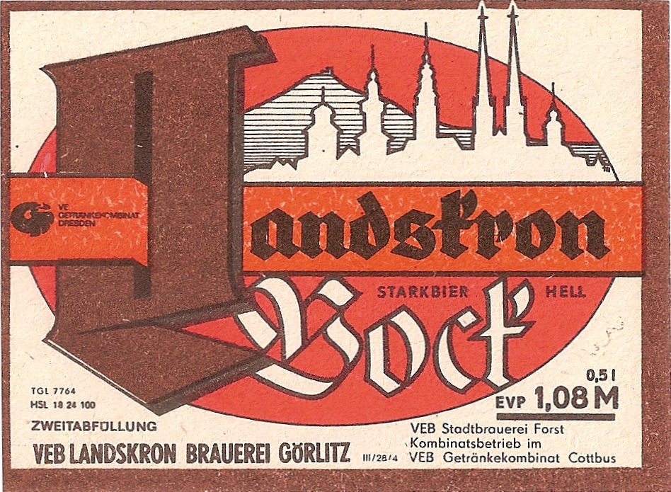
Personally, I wouldn't even recognise it as a Latin character. I wonder who came up with it, why and when? Just has a quick look on the brewery's website. And there's a photo of a railway carriage with the "L" written in a very similar way. So it looks like the weird letter predates WW I.
The brewery has had an interesting life over the last 60 years. Before WW II, it was run by the Scheller family. It was partially nationalised in 1959, then full nationalised in 1972. (The takeover of lots of middle-sized family firms in that year, under orders from the Soviets, is what did for the DDR economy.) Returned to the Scheller family in 1993, it was sold on to Holsten in 2003, who in turn sold it to Carlsberg. Threatened with closure, the brewery was puchased by the Lohbecks, a husband and wife team, in 2006.
They currently brew a pretty wide range of beers:
| Landskron Beers 2017 | ||
| Beer | OG Plato | ABV |
| Premium Pilsner | 11.6º | 4.80% |
| Hell | 10.9º | 4.50% |
| Pupen-Schultzes Schwarzes | 9.8º | 3.80% |
| Weizen | 12.8º | 5.50% |
| Lager | 13.3º | 5.30% |
| Edel-Bitter | 11.9º | 5.00% |
| Kellerbier | 12.2º | 5.20% |
| Bernstein | 14º | 5.20% |
| Maibock | 16.5º | 6.30% |
| Goldbock | 16.5º | 6.30% |
| Winterhopfen | 13.3º | 5.30% |
| Aktiv | 9.5º | 3.50% |
| Source: | ||
| Brewery website. | ||
Anyway, here are some of their pretty labels:


3 comments:
I love the solid steelwork of the top three Ls. Long live the Workers' Republic! Victory to the Seven-Year Plan!
The L is a variant of the Alte Schwabacher font capital L. Schwabacher font was common in the early 16th century, then replaced by Fraktur fonts
As Gunnar says, the double stem capital L is typical for blackletter scripts of the Textura and Schwabacher type, though this example is extremely eccentric (and the rest of the lettering isn’t in a Schwabacher style at all!)
Post a Comment